 Get Custom Soccer Designs from $10 – Fast Delivery & Premium Quality! 🚀
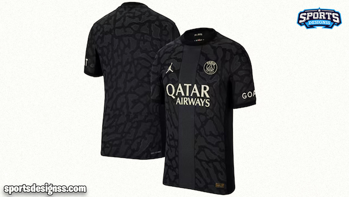
“A Closer Look at the Unique PSG Third Kit Champions League Font”
The PSG Third Kit for the Champions League has caused quite a buzz among fans, and it’s not just because of the team’s performance. The font used for the player names and numbers on the kit is unlike anything we’ve seen before. In a sea of traditional designs, this font stands out boldly with its unique characteristics.

A Closer Look at the Unique PSG Third Kit Champions League Font
What Makes it Unique?
The first thing that catches your eye is the bright orange color used for the names and numbers. It’s a departure from the usual colors associated with PSG’s kit, making it instantly recognizable. The Ligue 1 numbers, in contrast, are white with an orange edge, creating a striking contrast.
Design Details
But it’s not just the color that makes this font special. The design itself is a work of art. The font takes on a deconstructed look, as if it’s been pulled apart and reassembled. This gives it an edgy, contemporary feel that resonates with the modern aesthetic.
If you examine the font closely, you’ll notice a unique feature at the bottom of the numbers – a melting effect. It’s almost as if the numbers are slowly dissolving, adding a touch of dynamism to the overall design. This melting effect adds an extra layer of intrigue to the font, making it a conversation starter for fans and design enthusiasts alike.

A Closer Look at the Unique PSG Third Kit Champions League Font
Your Opinion Matters
Now, the big question is: Do you like the new PSG Third Kit Champions League font? We’d love to hear your thoughts. Is it a bold departure from tradition or a design misstep? Share your opinions in the comments below, and let’s discuss this unique font that has taken the football world by storm.
In conclusion,
PSG’s choice of font for their Champions League kit is a testament to the club’s commitment to innovation and pushing the boundaries of design. With its bright orange color and deconstructed, melting look, it’s a font that demands attention and sparks conversations. Whether you’re a PSG fan or simply a design enthusiast, this font is sure to leave a lasting impression. Share your thoughts and join the discussion on this unique PSG Third Kit Champions League font.

A Closer Look at the Unique PSG Third Kit Champions League Font
FAQs
Why did PSG choose such a bold and bright orange color for the font on their Champions League kit?
PSG opted for the bright orange color to create a striking and unique look that stands out from traditional designs and captures attention.
Are the Ligue 1 numbers on the kit designed differently from the Champions League font?
Yes, the Ligue 1 numbers are white with an orange edge, creating a distinct contrast from the orange font on the Champions League kit.
What inspired the deconstructed look of the font?
The font’s deconstructed appearance is a deliberate design choice, adding a modern and edgy aesthetic to the kit’s overall look.
How does the melting effect at the bottom of the numbers contribute to the font’s design?
The melting effect adds a dynamic element to the font, making it visually captivating and enhancing its uniqueness.
Is this font exclusive to PSG’s Champions League kit, or will it be used in other contexts as well?
While primarily designed for the Champions League kit, PSG may use this font for special occasions or limited-edition releases.
Do other football clubs use similarly unconventional fonts for their kits?
Some clubs experiment with unique fonts, but PSG’s font for the Champions League kit stands out for its bright orange color and deconstructed design.
How have fans reacted to the PSG Third Kit Champions League font?
Fan reactions have been mixed, with some praising the boldness of the design, while others have expressed more traditional preferences.
Can fans purchase merchandise with this font design, such as replica jerseys?
Yes, PSG typically offers merchandise featuring the Champions League font for fans to purchase and show their support for the team.
Does the font’s uniqueness affect its readability on the kit during matches?
The font’s readability has not been a significant issue, as it retains the clarity necessary for player names and numbers on the kit.
Are there any plans for PSG to collaborate with designers for future kit fonts?
PSG occasionally collaborates with designers and brands for special kit releases, so there may be exciting font designs in the future for fans to look forward to.
Add a review
Your email address will not be published. Required fields are marked *